Redesign Project
Optimising the Clinic Booking Flow Through Systematic Usability Evaluation
Bowtie & JP Health Clinic Booking Flow Redesign
Role
Design & UX Research
Team
Just Me
Year
2026
Project Type
Personal Project


Overview
Booking a clinic appointment should be straightforward. Instead of redesigning the experience from scratch, this project began by understanding how the existing booking flow performed and where it introduced unnecessary friction. Using heuristic evaluation, a cognitive walkthrough, and moderated usability testing, I evaluated the current experience to identify usability issues, prioritise them by their expected impact, and redesign the flow based on those findings.
The result is an evaluation-led redesign. Rather than claiming product improvements through business metrics, the proposed changes represent evidence-informed design hypotheses grounded in established usability principles.
Moderated Usability Testing
I conducted one moderated session with a user completing scenario-based tasks, measuring task completion rate and observing where confusion arose.
Heuristic Evaluation
I audited six booking screens against Nielsen's ten usability heuristics, rating each issue by severity and frequency. This revealed patterns of inconsistency and unclear feedback that would be difficult to spot in isolation.
Cognitive Walkthrough
I stepped through the flow from a first-time user's perspective, asking at each decision point whether the user would know what to do, how to do it, and whether they would recognise that they had done it correctly.
Issues
The audit showed that the booking experience was not failing because of a single usability problem. Instead, a series of small friction points accumulated throughout the journey, making the process harder to understand and reducing confidence as users progressed.
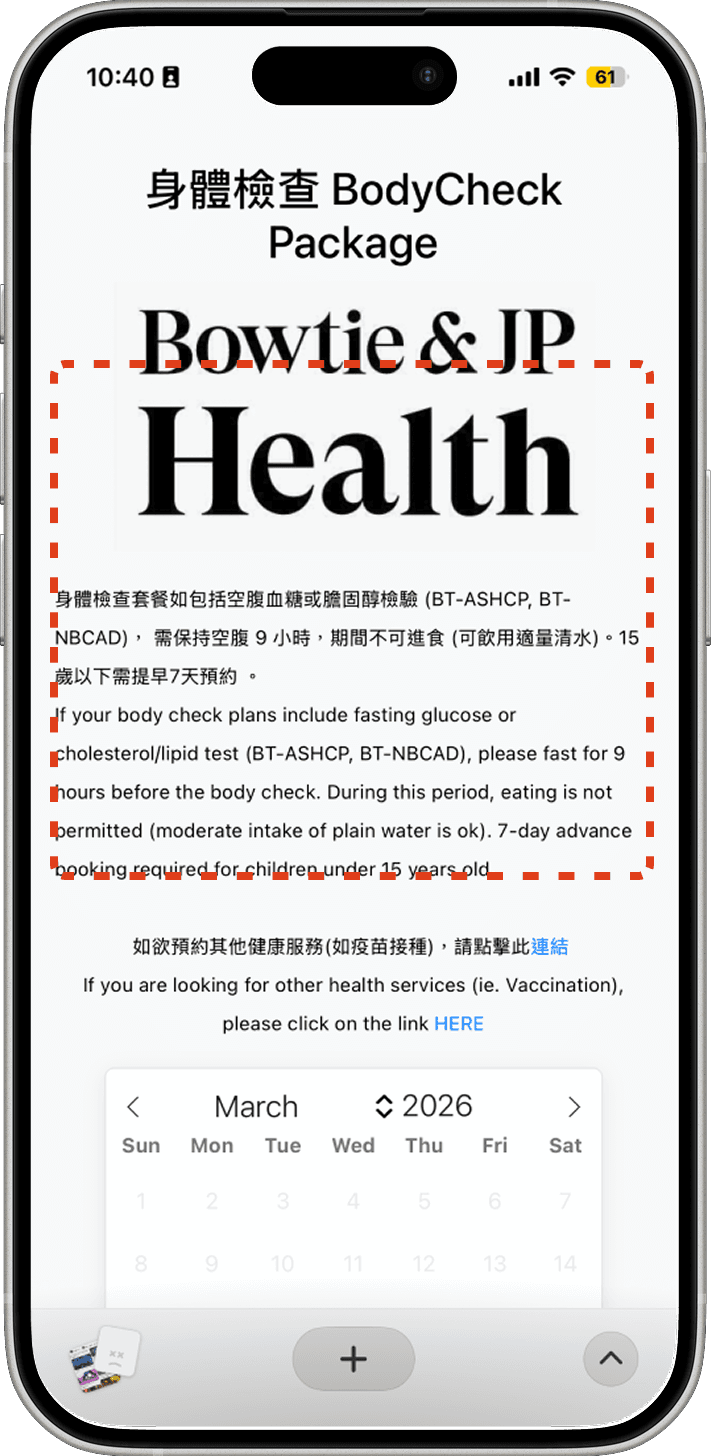
Bilingual Overload
Every label, button, and instruction appeared in both English and Chinese simultaneously. This created unnecessary clutter, slowed reading time, and consumed valuable space on mobile screens. The result was harder to scan, harder to complete.
Missing progress indicator
Users had no clear sense of where they were in the booking process. Three steps in, they could not tell if they were almost done or barely started. This uncertainty made the journey feel longer than it was.


Body-check section expanded on load
The body-check section expanded by default, creating visual imbalance and pushing other services below the fold on mobile. Users had to scroll past content they had not chosen to see before reaching what they actually wanted.
Success headline in red text
The confirmation message "預約成功!" appeared in red. Red signals error everywhere in interface design. At the peak moment of user confidence, the design was undermining trust.


Design Direction
Rather than replacing the existing booking flow, I treated it as a foundation. The redesign focused on strengthening the experience by preserving the interaction patterns that already worked while addressing the usability issues that introduced unnecessary friction.
The guiding principle: reduce unnecessary friction while introducing deliberate moments of confirmation where confidence matters.
Redesign
Each change in the redesign maps to a specific issue identified during evaluation.

Language Toggle
I added an EN / 中 toggle at the top right. One tap adapts the entire interface. Users read in their preferred language without the cognitive load of parsing both simultaneously.
Persistent Progress Indicator
I added a four-step progress bar that persists across every screen. Completed steps are filled with teal. Once users can see the finish line, they want to cross it.


Form + Confirmation, Separated
Both clinic addresses appeared on one page — after the user had already chosen one. Personal details and a review summary were crammed into the same screen. I split this into two: a clean form, then a confirmation page. Show only what is needed at each step. No confusion, no doubt.
Teal Means Success
I replaced the red success message with a teal checkmark and a clean confirmation card, including Add to Calendar and key notes. Not a dead end.


Brand Consistency
The redesigned interface uses Bowtie & JP Health's teal (#2B7A78) consistently across every screen — active states, selections, CTAs. Gray signals "not ready yet." The body-check section no longer auto-expands. Key content stays visible.
Reflection
This project was completed within five days, so the scope focused on the issues with the greatest expected usability impact. Because the redesign was driven primarily by heuristic evaluation, the proposed solutions should be viewed as evidence-informed design hypotheses rather than validated product outcomes.
Future work would include usability testing and product metrics to validate whether these changes reduce friction and improve completion. The biggest takeaway was that confidence is built through many small design decisions. Clearer hierarchy, better system feedback, and deliberate confirmation points can make a complex booking journey feel simpler without fundamentally changing how the product works.